Difference between revisions of "GoneClear Storefront"
(change "personality" to "Basic" for chap1 h1) |
(Customizing Column Header) |
||
| Line 110: | Line 110: | ||
<li>Update: Modify the data of an existing record or document</li> | <li>Update: Modify the data of an existing record or document</li> | ||
</ul> </div> | </ul> </div> | ||
| + | |||
| + | ==== <span style="color: #004b64; font-size: 30px;">Customizing Column Header</span> ==== | ||
| + | <div style="color: #004b64; font-size: 20px; "> User can easily customize the way information is displayed within any of the panel. | ||
| + | <ul> | ||
| + | <li>Users can reorder the columns by clicking and dragging the column headers to new locations. </li> | ||
| + | </ul> | ||
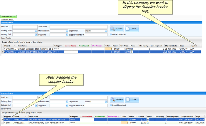
| + | <div style="color: #004b64; font-size: 20px; "> For example, if you want to display the supplier column first, simply click and drag the supplier header to the first column. See figure 2-5:</div> | ||
| + | <br> | ||
| + | [[File:Arrange_column_header.png|700px|frameless|center]] | ||
| + | <div style="color: #004b64; font-size: 20px; text-align: center;">Figure 1-7: Rearrange columns.</div> | ||
| + | |||
| + | <ul> | ||
| + | <li> Users can apply filters to one or more column headers. </li> | ||
| + | </ul> | ||
| + | <div style="color: #004b64; font-size: 20px; "> Hover over a column header and then click the filter icon located in the upper-right corner. For example:</div> | ||
| + | <br> | ||
| + | [[File:Filter_icon.png|300px|frameless|center]] | ||
| + | <div style="color: #004b64; font-size: 20px; text-align: center;">Figure 1-8: Rearrange columns</div> | ||
| + | <br> | ||
| + | |||
| + | <ul> | ||
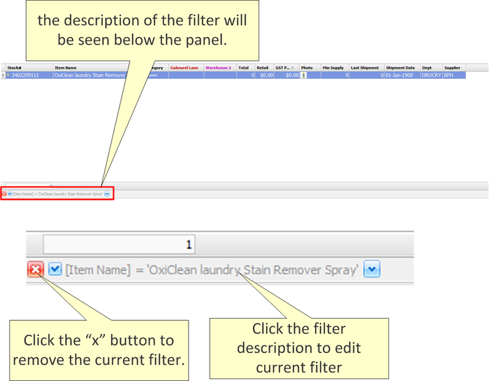
| + | <li> Use the filter menu to select which of the values currently in the column should be displayed. When you add a column filter, the description of the filter will be seen below the panel. You may use this to validate which column filters have been added to the current view and you may adjust the filter. For example: </li> | ||
| + | </ul> | ||
| + | <br> | ||
| + | [[File:Edit_and_remove_filter..png|700px|frameless|center]] | ||
| + | <div style="color: #004b64; font-size: 20px; text-align: center;">Figure 1-9: Edit and Remove filter</div> | ||
| + | <br> | ||
| + | |||
| + | {| class="wikitable" | ||
| + | |- | ||
| + | ! Terminology !! Definition | ||
| + | |- | ||
| + | | Sort Ascending || Sorts the selected column in ascending order. | ||
| + | |- | ||
| + | |Sort Descending || Sorts the selected column in descending order. | ||
| + | |- | ||
| + | | Clear Sorting || Clears the ascending or descending sorting criteria currently set for a column. | ||
| + | |- | ||
| + | | Group By This Column || Groups the table using the data in the selected column. It does this by moving the data into expandable lists that are located in the body of the grid. One expandable list will be created for each possible column value. | ||
| + | <br> | ||
| + | If you perform this action on any subsequent columns, that data will be presented as nested groups at increasingly lower levels within the expandable lists. | ||
| + | |||
| + | If '''''Group By Box''''' is enabled, this will also create a "Group By" box in the area immediately above the column headers. | ||
| + | Note: To turn off the Group By This Column feature and revert to the original view: Enable Group By Box, drag the Group By boxes back to the column header. | ||
| + | ::::Note: To turn off the '''Group By This Column''' feature and revert to the original view: Enable '''Group By Box''', drag the Group By boxes back to the column header. | ||
| + | |- | ||
| + | | Group By Box || Displays or hides an area immediately above the column headers that contains "Group By" boxes. One "Group By" box will be displayed for each column header for which Group By This Column is currently enabled. You can also drag column headers to and from this area. | ||
| + | <br> | ||
| + | The table will be grouped according to the data in the box. If there are two or more boxes then the grouping will be nested, with the left-most box presented at the highest level, the second box presented at the second level, etc. | ||
| + | |||
| + | |- | ||
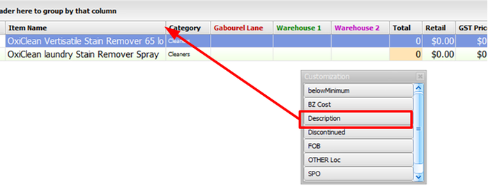
| + | | Column Chooser || Enables you to add and hide information within a table. When you select Column Chooser the Customization dialog is displayed. This dialog is used to store the columns you don't currently want displayed within the table. Simply click and drag the desired column headers from the table to the Customization dialog. For example, if you decide | ||
| + | <br> | ||
| + | [[File:Column_chooser.png|700px|frameless|center]] | ||
| + | <br> | ||
| + | :::'''NOTE: Column Chooser will not work on panels.''' | ||
| + | |||
| + | |- | ||
| + | | Best Fit || Resize the width of the selected column so that the header text is displayed in the optimal amount of space. | ||
| + | |- | ||
| + | | Best Fit (all columns) || Resizing the width of all columns in the table so that the header text is displayed in the optimal amount of space. | ||
| + | |- | ||
| + | | Filter Editor || The '''Filter Editor''' dialog will show any filters that are currently active in the column headers. You can use the editor to modify the existing filter criteria and to build new criteria using the available filter conditions and logical operators. | ||
| + | |} | ||
| + | |||
| + | </div> | ||
| + | |||
<br> | <br> | ||
Revision as of 18:32, 20 October 2020
Contents
Basics of GoneClear StoreFront
In This Chapter
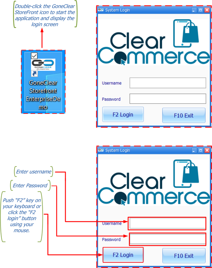
Getting Started
To start GoneClear StoreFront, double-click the icon shown in Figure 1-1
A user name and a password must be entered in order to log into the company database. For audit purposes, user information is recorded in every new record or modification to an existing record that a user performs.
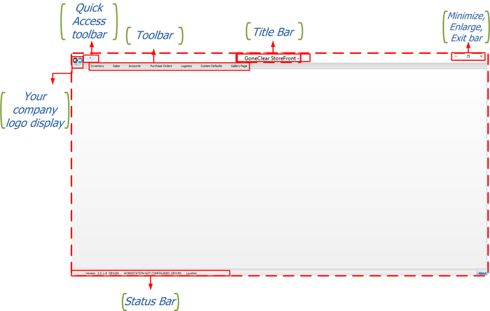
Knowing Where You Are
The Main Window
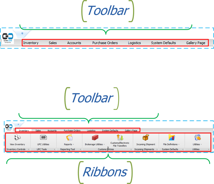
Toolbar and Ribbon
Quick Access Tool bar
The Status Bar
- The bottom left-hand side displays the version of GoneClear StoreFront, the user who signed in, the name of the computer station in use and the location of the shop.
- The bottom left-hand side will also display when a user is in "sales mode".
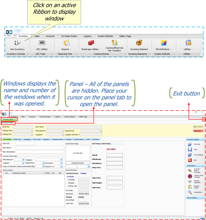
Windows and Panel
A new window will open by clicking on an active Ribbon. All windows would include the exit button to exit the active window. As mentioned earlier in this guide, it is possible to have many windows open at once.
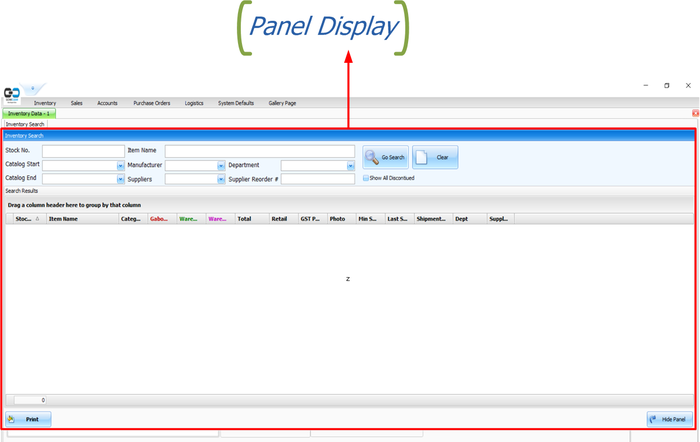
Several windows have a panel that gives access to more choices within the active window.
Window Operation Modes
- Add: Add a new record or document
- View: View an existing record or document
- Update: Modify the data of an existing record or document
Customizing Column Header
- Users can reorder the columns by clicking and dragging the column headers to new locations.
- Users can apply filters to one or more column headers.
- Use the filter menu to select which of the values currently in the column should be displayed. When you add a column filter, the description of the filter will be seen below the panel. You may use this to validate which column filters have been added to the current view and you may adjust the filter. For example:
| Terminology | Definition |
|---|---|
| Sort Ascending | Sorts the selected column in ascending order. |
| Sort Descending | Sorts the selected column in descending order. |
| Clear Sorting | Clears the ascending or descending sorting criteria currently set for a column. |
| Group By This Column | Groups the table using the data in the selected column. It does this by moving the data into expandable lists that are located in the body of the grid. One expandable list will be created for each possible column value.
If Group By Box is enabled, this will also create a "Group By" box in the area immediately above the column headers. Note: To turn off the Group By This Column feature and revert to the original view: Enable Group By Box, drag the Group By boxes back to the column header.
|
| Group By Box | Displays or hides an area immediately above the column headers that contains "Group By" boxes. One "Group By" box will be displayed for each column header for which Group By This Column is currently enabled. You can also drag column headers to and from this area.
|
| Column Chooser | Enables you to add and hide information within a table. When you select Column Chooser the Customization dialog is displayed. This dialog is used to store the columns you don't currently want displayed within the table. Simply click and drag the desired column headers from the table to the Customization dialog. For example, if you decide
|
| Best Fit | Resize the width of the selected column so that the header text is displayed in the optimal amount of space. |
| Best Fit (all columns) | Resizing the width of all columns in the table so that the header text is displayed in the optimal amount of space. |
| Filter Editor | The Filter Editor dialog will show any filters that are currently active in the column headers. You can use the editor to modify the existing filter criteria and to build new criteria using the available filter conditions and logical operators. |
